IDEA StatiCa

When team habits have the last word
| Implemented: | 2021 |
|---|---|
| Řešené plochy: | 460 m² |
| Place: | Brno |
| Architect! | PREMIER interiors – Ing. arch. Michal Štancl |
| Photographer | Photo: Jiří Alexander Bednář |
| Service: | interior design and implementation |

Team habits and working with zones in architectural design and implementation for Idea StatiCA
Every company has a unique way of working, which fundamentally influences the needs of the office layout and zones. Therefore, it is always crucial for us to have a good understanding of the rhythms and habits within the team of the company we will be creating space for. Right off the bat then comes style preferences and design.
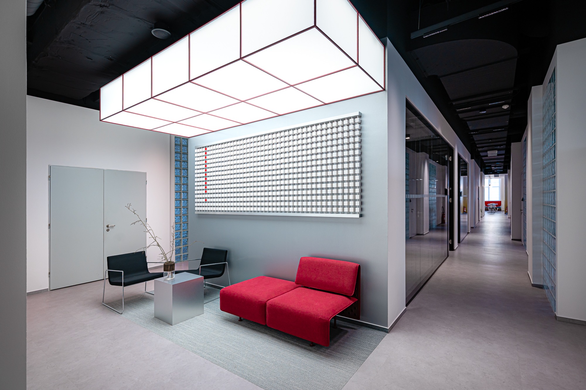
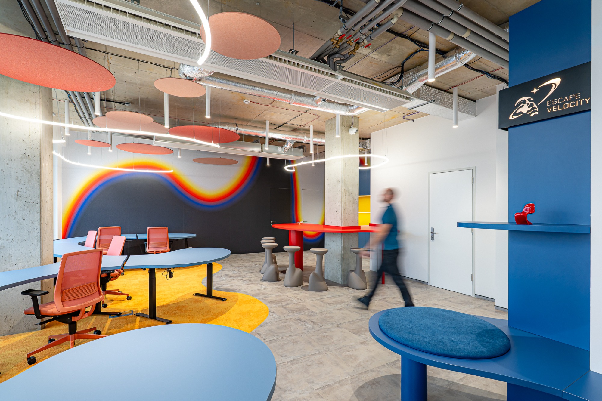
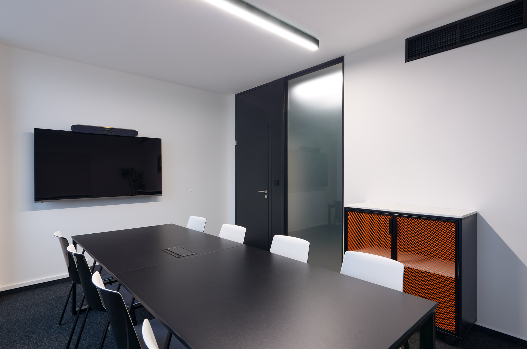
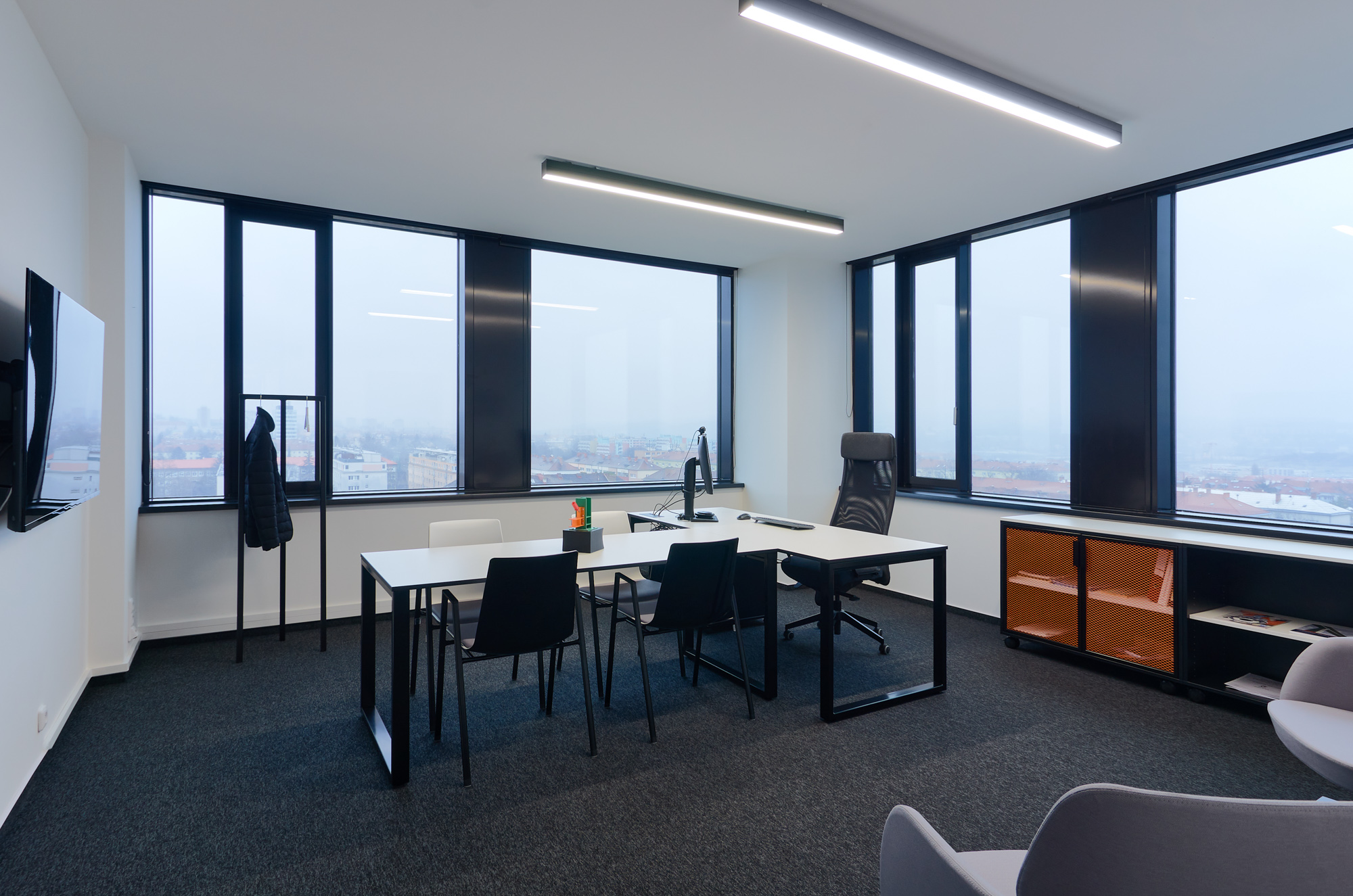
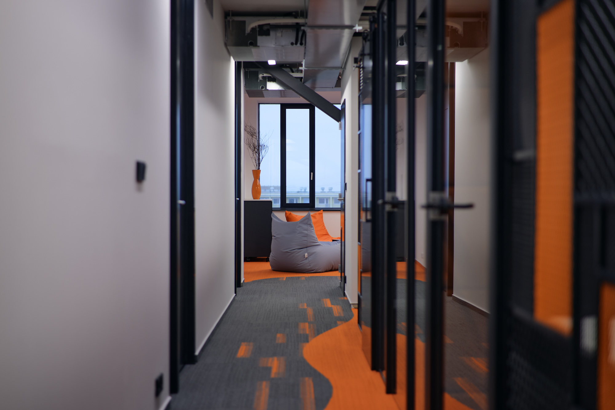
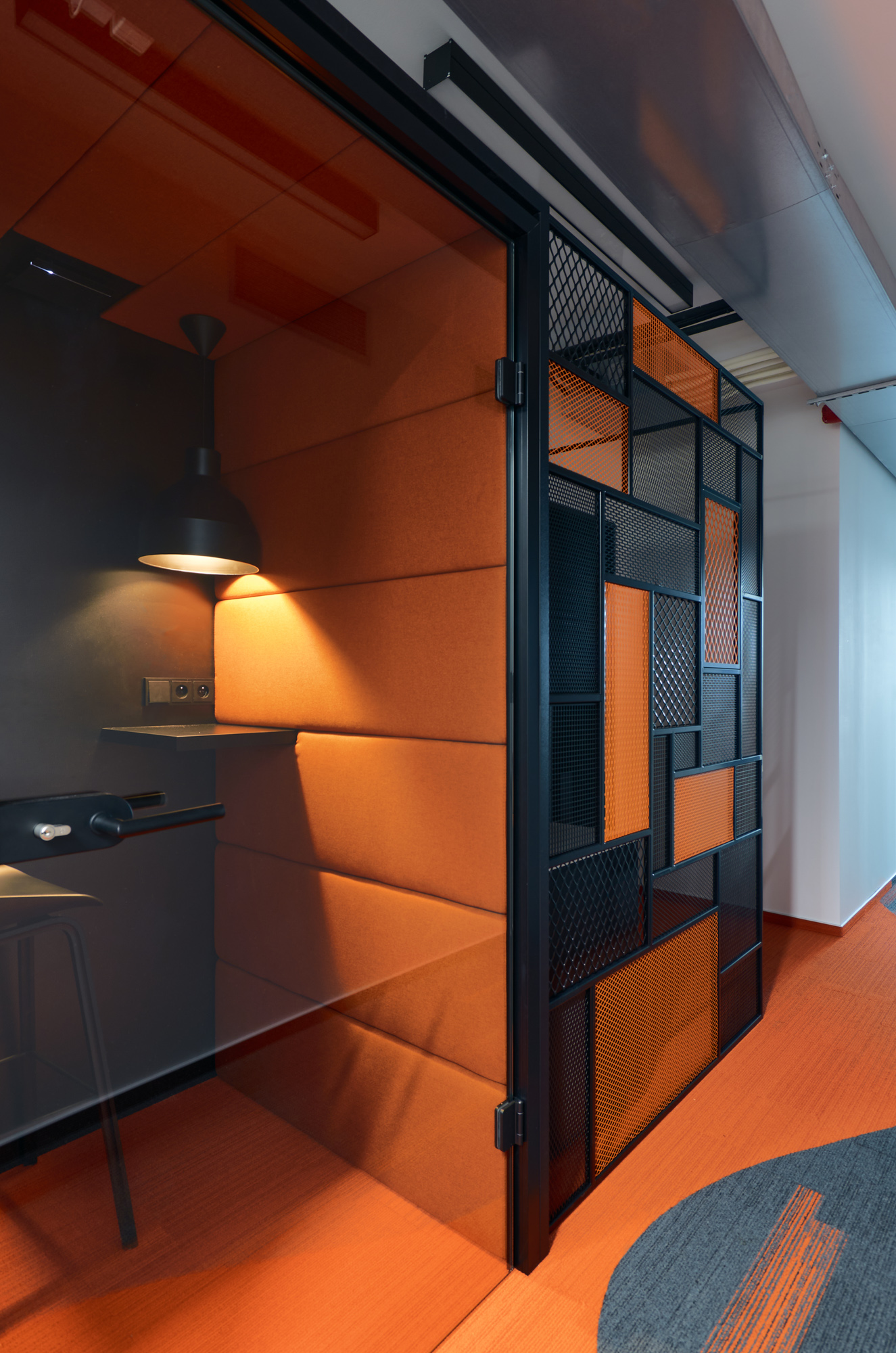
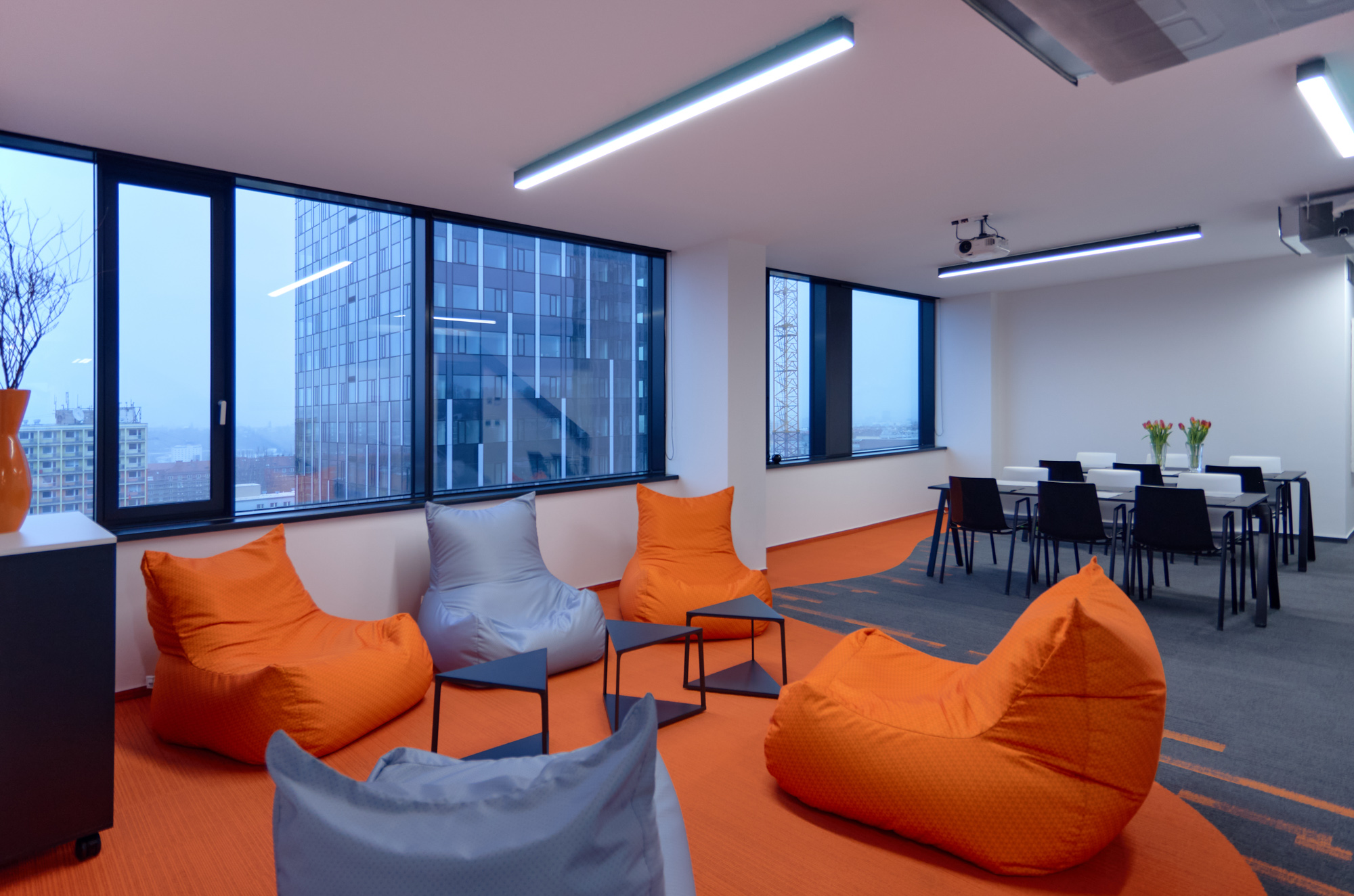
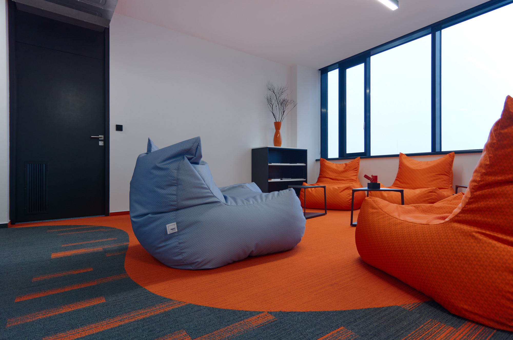
Idea StatiCa's office space is a combination of open space and offices for smaller teams and management. There is a relaxation area, meeting space or phone booths that offer privacy for important calls.
Corporate identity included in the design
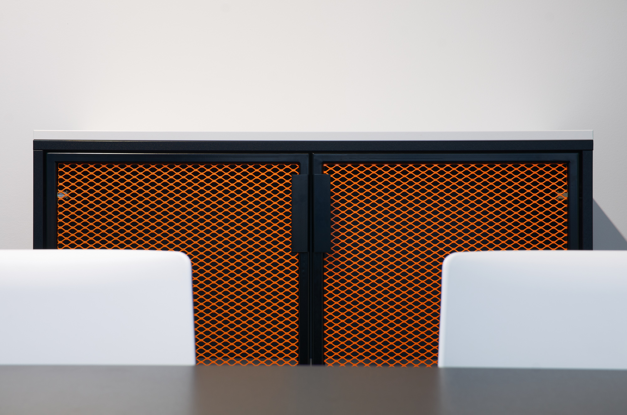
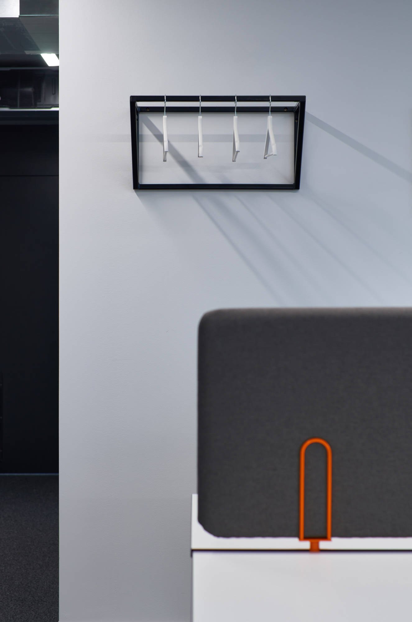
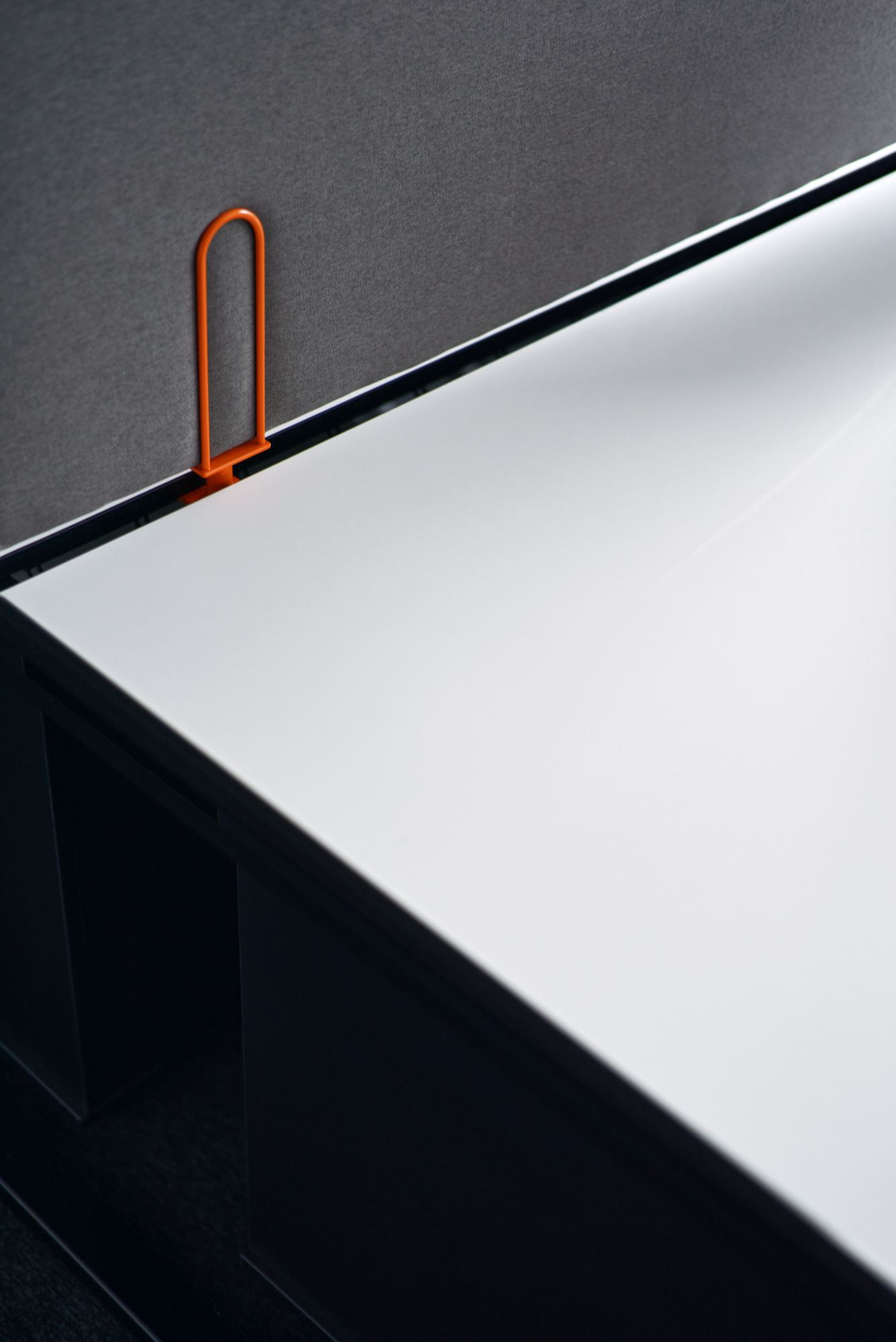
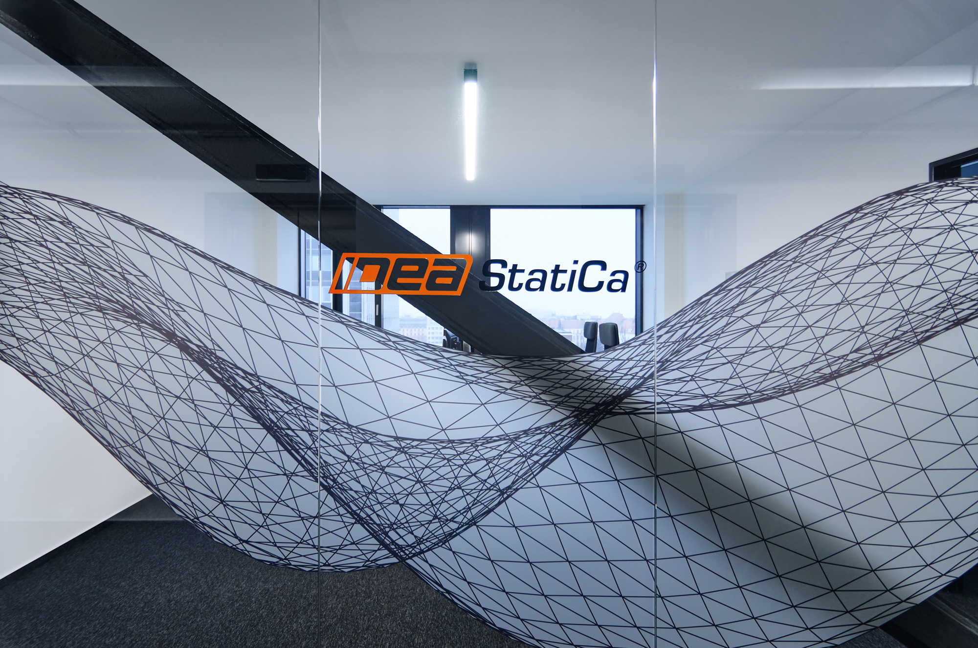
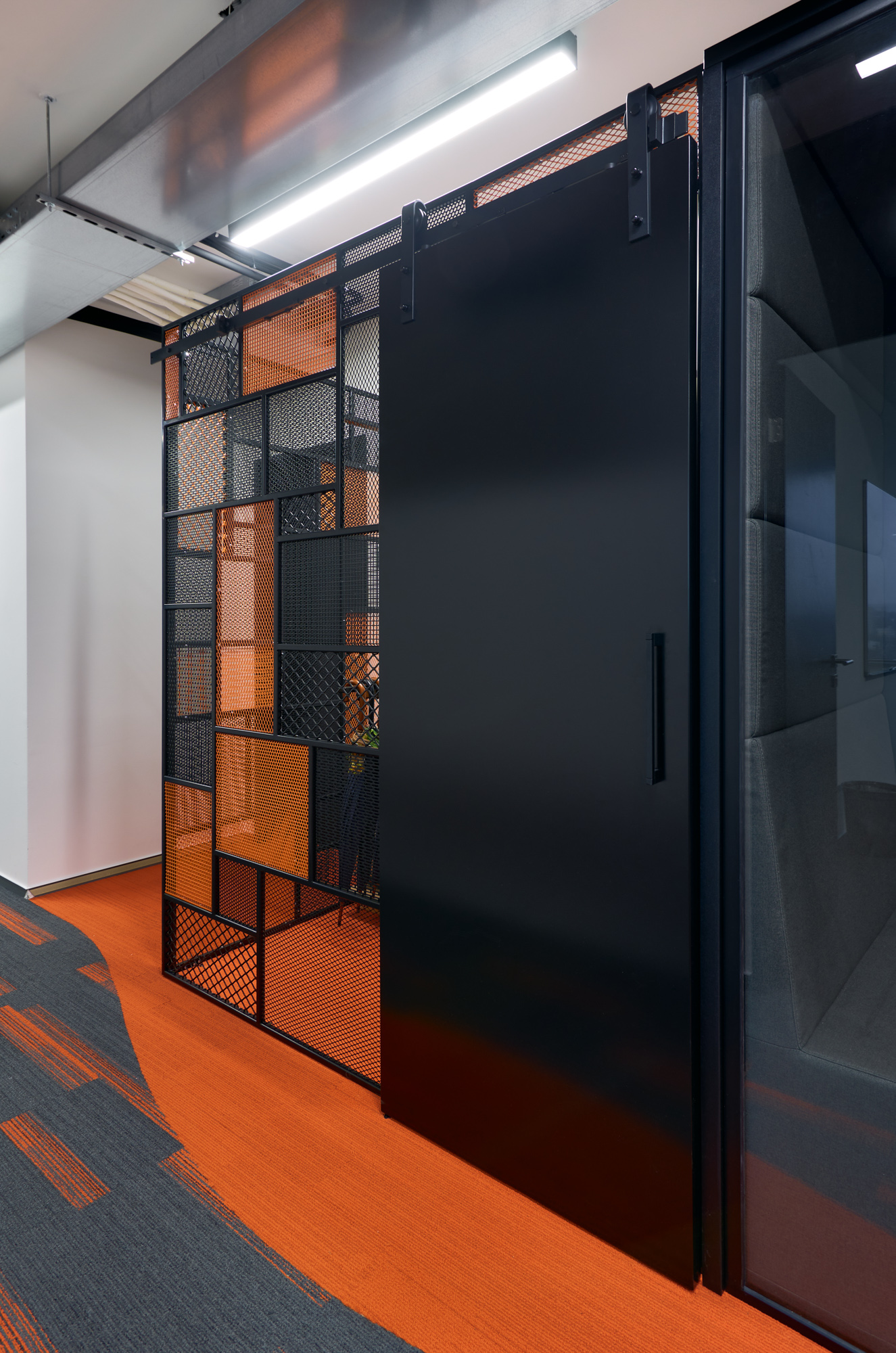
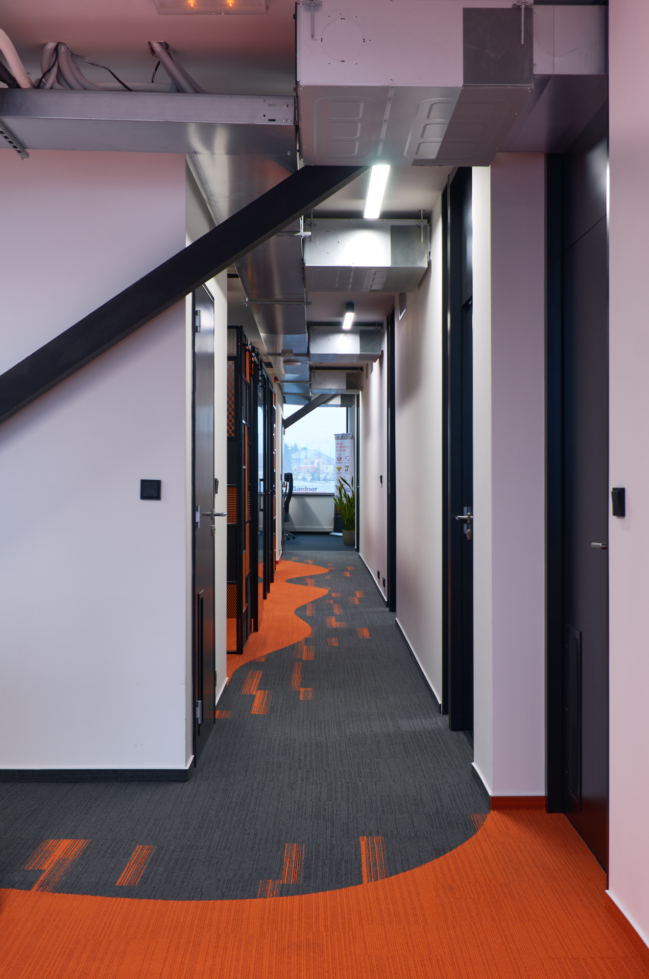
Idea StatiCa develops software for building design solutions. The company's focus and visual identity is written into the interior design, which incorporates industrial elements and rich orange details based on the logo. The aforementioned industriality is represented by metal. The structure includes massive stiffeners that go around the core. These are linked by a set of perforated sheet metal cabinets. This is also used for the doors of the smaller storage spaces in the offices. The metal hangers or tables in the rest area refer to the stiffeners and the metal structures of the desks and chairs are also metal.
Lightness and colour playfulness
In order to prevent the metal from appearing too heavy in the office interior, we have lightened it in several ways. We applied a semi-transparent coating to the glass partitions that resembles a twisted horizontal structure. Textile materials also found their place here in the form of carpets, upholstery on the screens between the desks and on the walls of the telephone boxes, or in the form of sofa bags in the rest area. Textile elements are also an ideal solution for the acoustics of the space.
The orange colour plays a more prominent role in the common areas, where it contrasts with the black and grey on carpets, cabinets, upholstery and sofas. In the interior of individual offices, we used it more on subtle details such as the anchoring of screens or cabinet doors, so as not to be distracting.

First meeting is free!


Do you like our work?
From greyish boredom into your brand’s colors!
First meeting is free.